使用指南
AI 图像提示词库:按用例整理的 10 条生产可用提示词
十条提示词已在 hiapi 的 task API 上跨五个真实场景进行测试——电商、社媒、头像、产品展示与编辑插画——并附上实测有效的模型与宽高比。
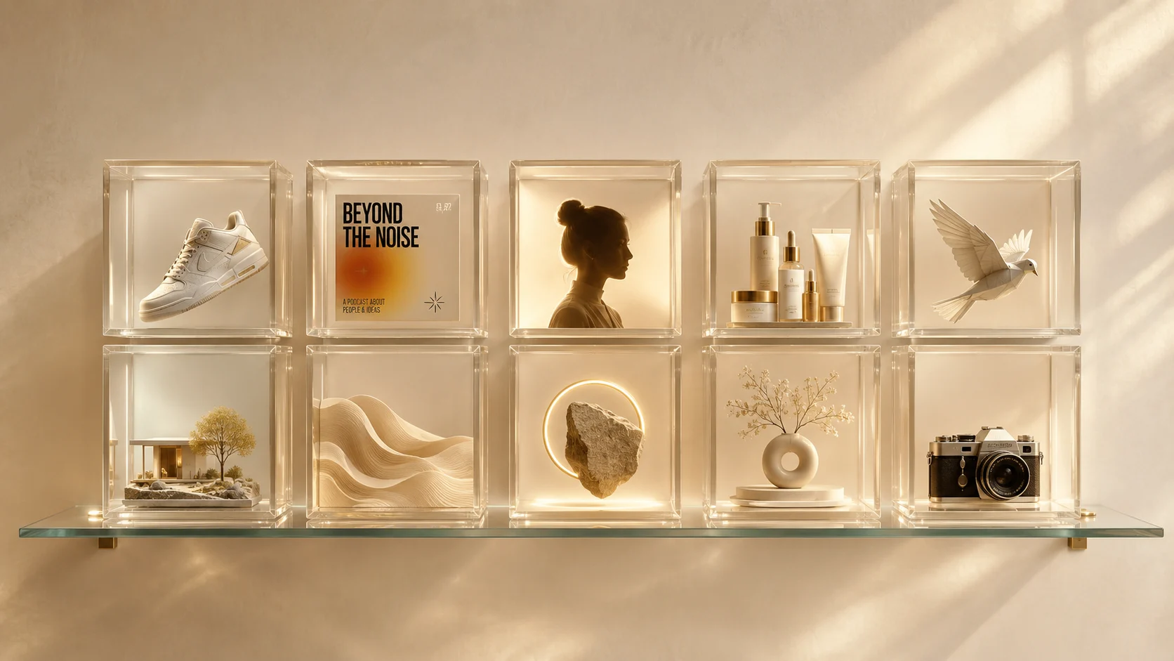
网上大多数提示词库其实都是变相的灵感墙:漂亮的截图,没有模型标注,没有分辨率,没有宽高比,也无从得知结果在缩小后或生产环境中是否依旧可靠。本库恰恰相反。下面每一条提示词都经过了 hiapi 的 task API 实测,并注明了模型与宽高比。直接放进你自己的流程里,改一个名词,第一次尝试就能得到可用的结果。
这个合集按五大用例组织——它们占据了生产级图像工作的绝大多数:电商主图、社媒封面、头像、产品展示,以及风格化编辑插画。每一节把一条提示词与实测模型配对,好让你知道该选成本高效的 qwen-image-2.0($0.025/张)、照片级真实基准 flux-1.1-pro($0.05)、一致性友好的 Nano-Banana($0.05),还是文字渲染友好的 gpt-image-2(1K 分辨率下 $0.03)。
1. 电商主图
商品列表缩略图与生活场景图——每个产品都需要的两张图。缩略图放白底进目录;生活场景图为付费社媒广告注入生命力。始终把产品描述、光线和宽高比写明确;让模型去决定质感与调色。
提示词 1 —— 纯白目录缩略图(gpt-image-2,1:1)
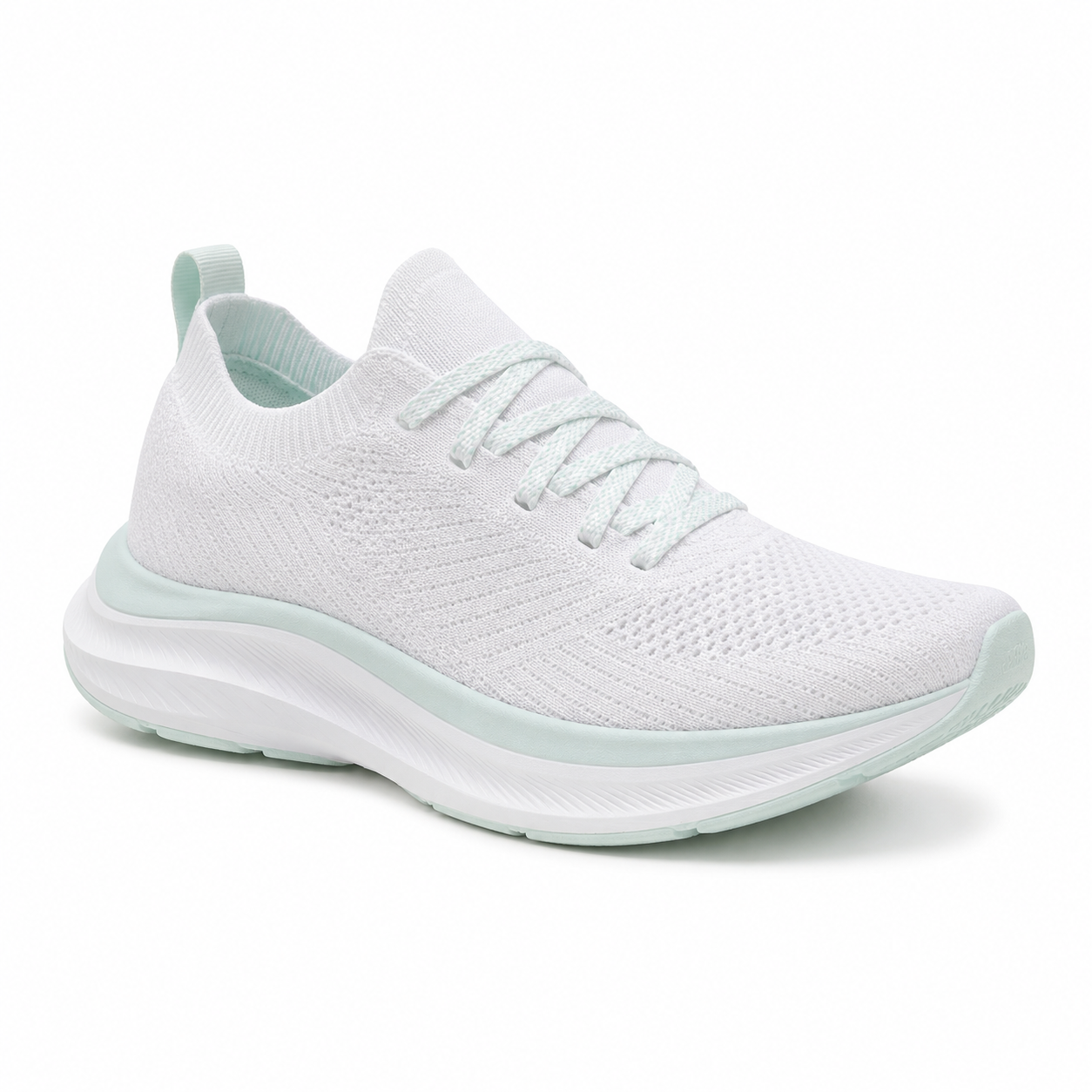
Studio product photograph of a single low-profile white knit running shoe with subtle mint
accents, centered on a pure white seamless cyclorama, soft top-down key light with a gentle
fill from camera left, contact shadow only, sharp focus on the heel cup and shoelace texture,
no logos, no text, 1:1 square crop suitable for an e-commerce listing thumbnail.
为什么有效。 这条提示词的写法就像给摄影师的需求说明:一个主体、一套布光、一种裁切。“仅保留接触阴影”可防止出现产品悬浮感。“无标识、无文字”这一点比听起来更重要——图像模型特别爱自己发明品牌标记。1:1 比例下用 gpt-image-2 实测花费 $0.03;如需更高保真的主图,换成 $0.17 的 Nano-Banana-Pro。
提示词 2 —— 生活场景动作图(flux-1.1-pro,4:3)
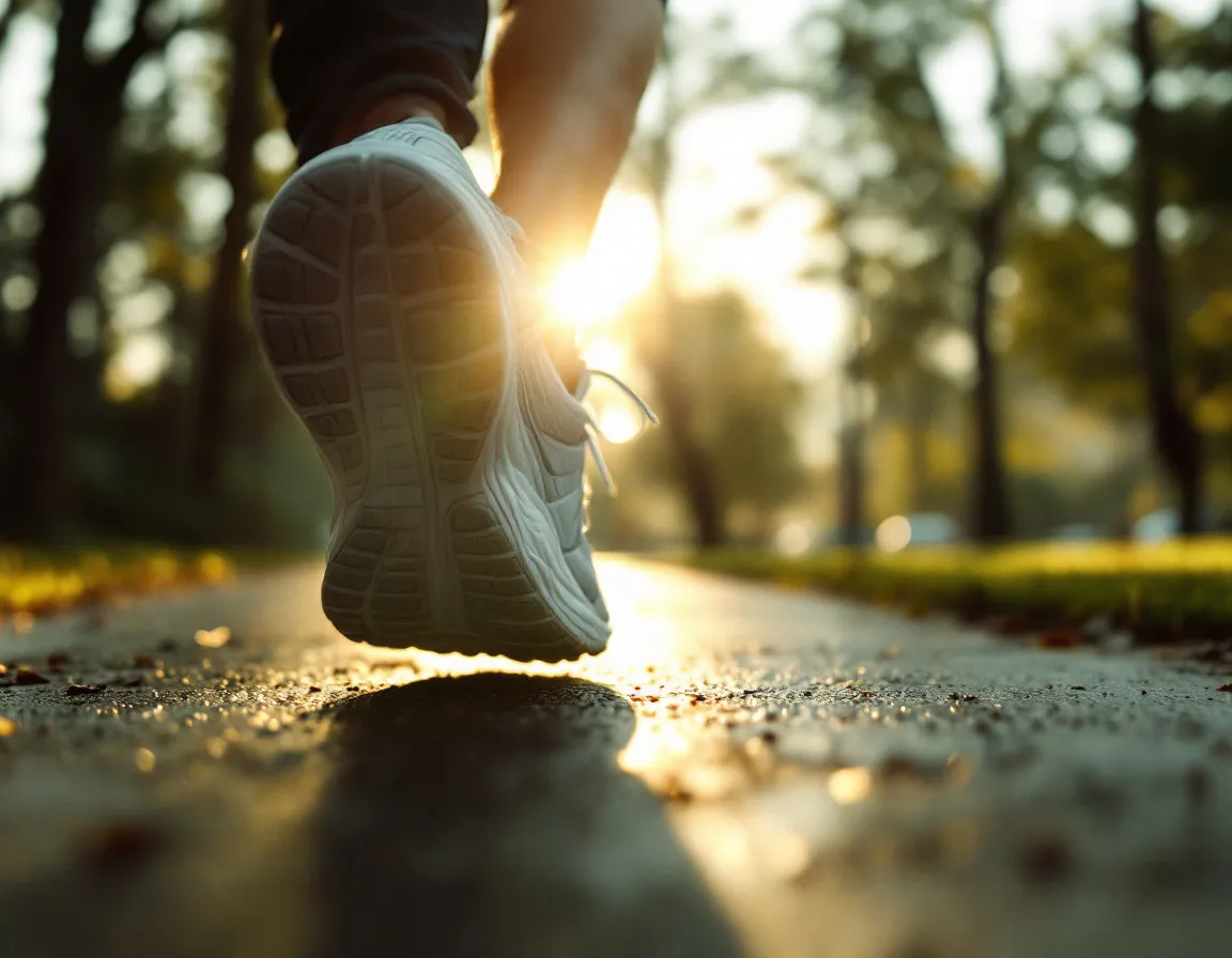
Editorial lifestyle photograph of the same white running shoe, now worn on a runner's foot
mid-stride on a damp morning sidewalk in a quiet park, golden hour rim light, shallow depth
of field f/2.0, slight motion blur on the trailing leg, faint warm fog in the background,
35mm film grain, color graded with muted greens and warm highlights, 4:3 aspect.
为什么有效。 flux-1.1-pro 是 hiapi 的照片级真实基准——它能稳定呈现纯白目录图所缺乏的胶片摄影感(胶片颗粒、镜头像差、大气雾感)。“f/2.0”和“35mm 胶片颗粒”这两个锚点承担了主要工作。4:3 是适合社媒的裁切比例:它不会被 Instagram 裁成方形,在 LinkedIn 上也清晰易读。
2. 社媒封面
能同时适应 LinkedIn 横幅、Spotify 播客封面和 X 页眉图的封面都具备一个共同特征:排版决策是在提示词里做出的,而不是事后才加。gpt-image-2 是渲染特定文字最可靠的模型;需要 4K 输出时,Nano-Banana-2 是替代选择。
提示词 3 —— 大号排版的播客封面(gpt-image-2,1:1)
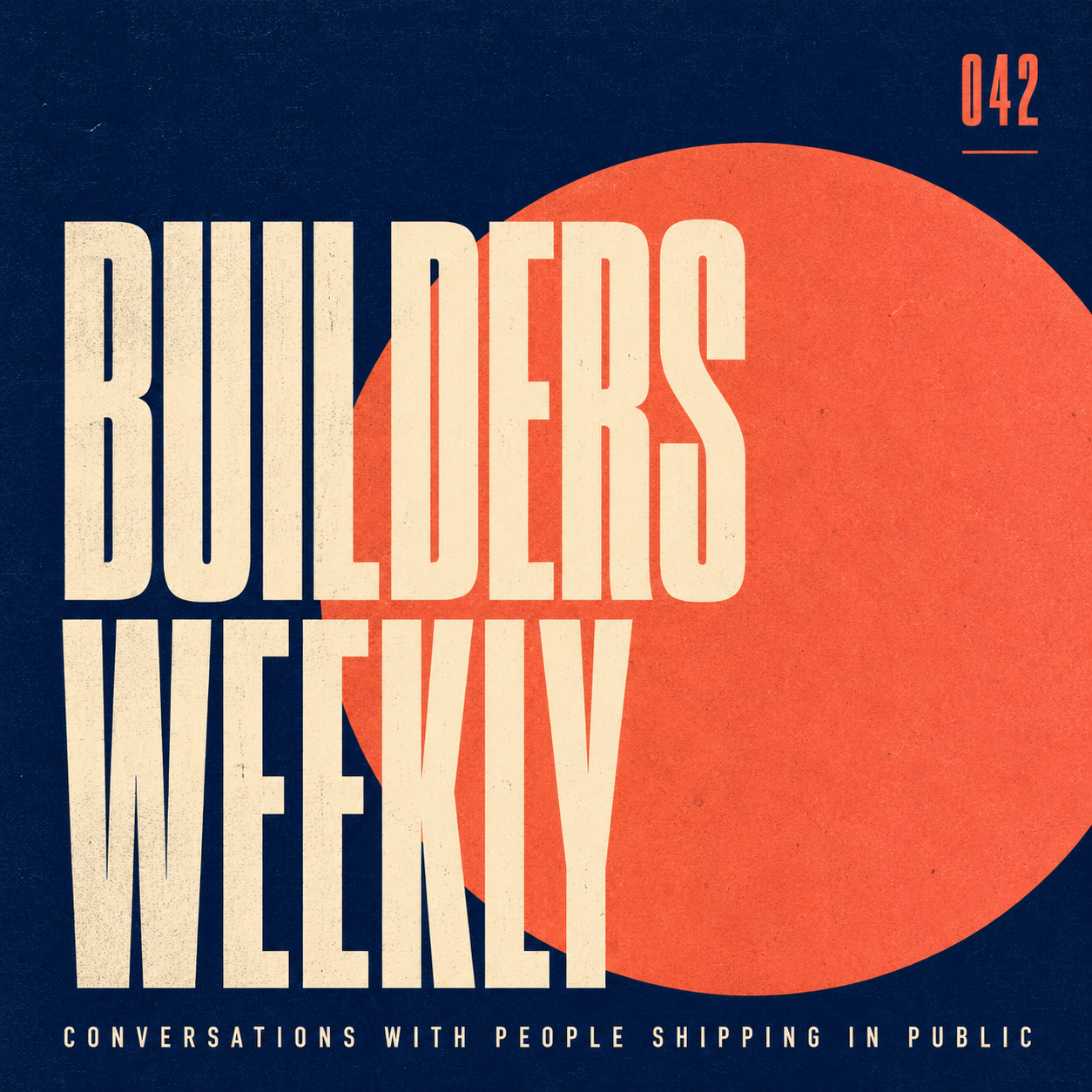
Square podcast cover: bold geometric layout, deep navy background with one large off-center
coral circle, condensed sans-serif title 'BUILDERS WEEKLY' in cream on three lines stacked
tightly, smaller all-caps tagline 'Conversations with people shipping in public' along the
bottom edge, episode number 042 micro-typed in the upper right, subtle paper grain, 1:1 aspect,
designed at Spotify cover proportions, no human faces, no logos.
为什么有效。 排版提示词有三条规则需要知道:(1)指定大小写形式(“全大写”);(2)指定布局位置(“三行紧密堆叠”“右上角”);(3)指明字体风格(“窄体无衬线”)。缺了这些,模型就会自由发挥,结果在无衬线语境里冒出衬线体。gpt-image-2 能可靠渲染每张图约 4-5 行以内的英文单词。
提示词 4 —— 带大标题的 LinkedIn 横幅(gpt-image-2,16:9)
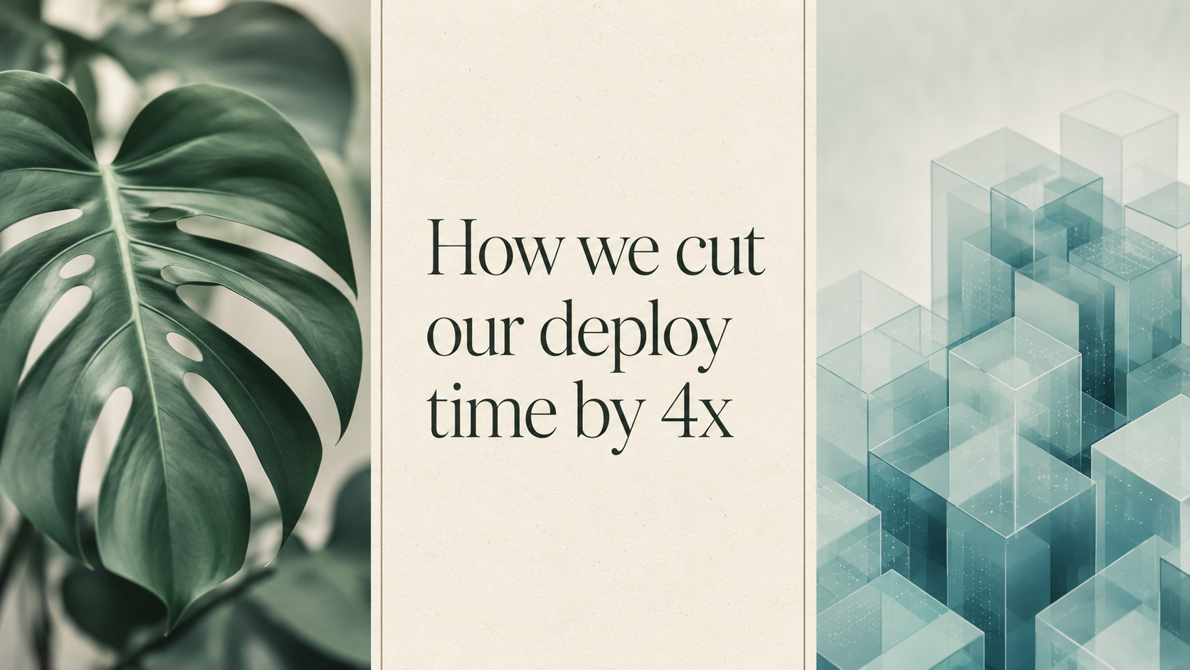
Wide LinkedIn banner: editorial collage layout, three vertical strips. Left strip a soft-focus
monstera leaf in jade green, middle strip a clean cream rectangle with the title 'How we cut
our deploy time by 4x' set in a refined serif at three lines, right strip an abstract isometric
render of stacked translucent cubes in pale teal. Thin separator lines in warm gray, subtle
paper texture, 16:9 ratio sized for LinkedIn 1584x396 proportions.
为什么有效。 “三条竖直条带”给模型一个硬性的构图网格;没有它,你得到的就是一堆重叠元素。“用直白的英文(1584x396)点明 LinkedIn 比例”与你传给 hiapi API 的 16:9 宽高比并不冲突,模型会把两者都当作设计意图。
3. 头像与人物肖像
两条路线:照片级真实头像(Nano-Banana 在多姿势间保持一致性方面很出色)与风格化几何头像(任何模型都能做;qwen-image-2.0 最便宜)。两者都需要明确描述年龄、肤色、发型和表情——含糊其辞只会产出诡异的平均值。
提示词 5 —— 专业照片级真实头像(Nano-Banana,1:1)
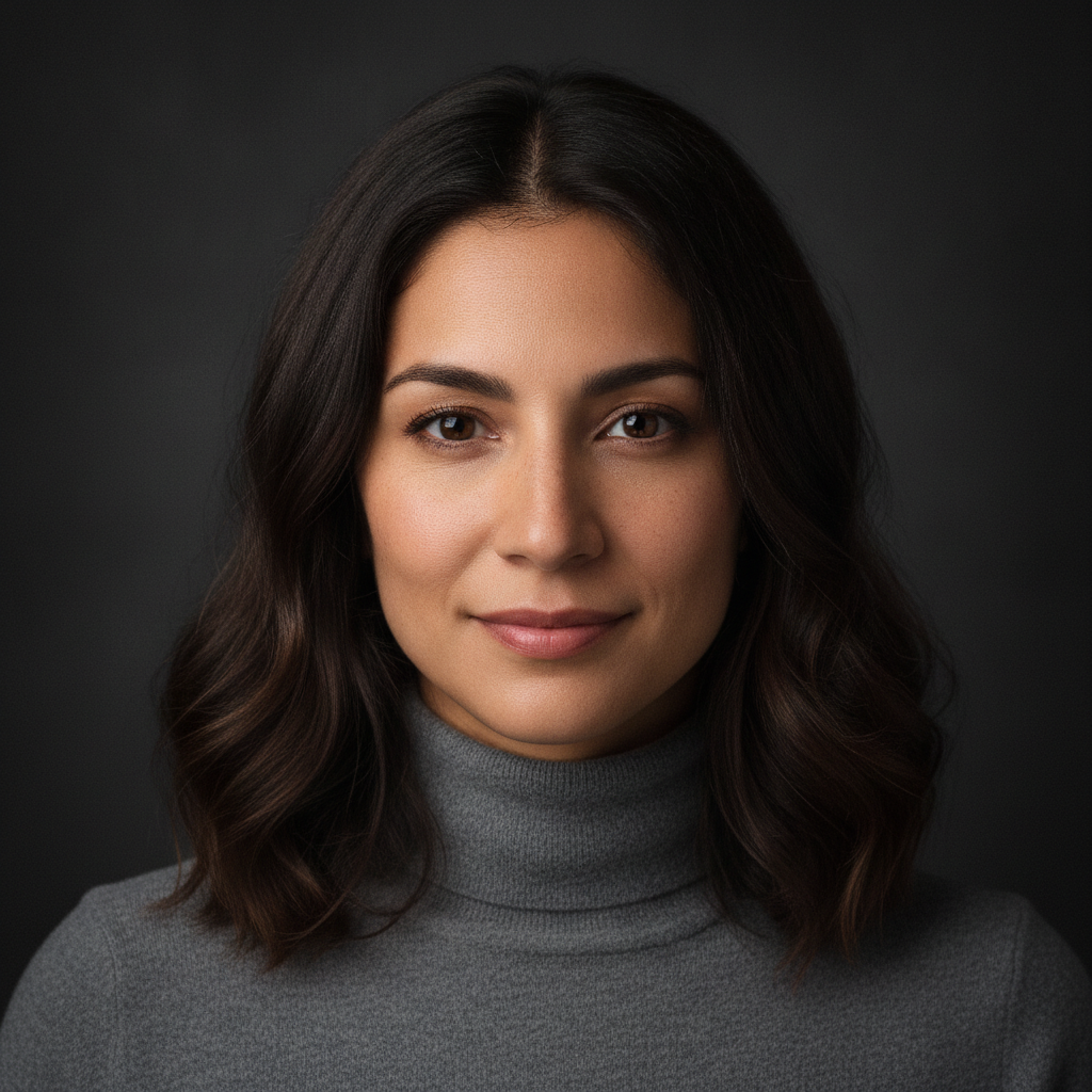
Professional headshot avatar: a 32-year-old woman with shoulder-length dark brown hair, warm
olive skin, faint freckles, wearing a soft charcoal turtleneck, neutral expression with a
gentle close-mouthed smile, looking directly at camera at eye level. Lit with a single large
softbox from camera left, dark seamless gray background falling off to near-black, 50mm
portrait lens, sharp focus on the eyes, subtle skin texture preserved, 1:1 square crop
tightened to the shoulders.
为什么有效。 “保留细微皮肤纹理”是所有肖像提示词里最重要的一句话——没有它,你就会得到那种平滑塑料感,一眼就能看出是 AI 头像。当你之后需要同一人物的更多姿势时,Nano-Banana 也是正确的选择;它在角色一致性上的口碑并非营销话术。
提示词 6 —— 扁平几何头像(Nano-Banana,1:1)

Stylized avatar illustration in a flat geometric style: a young man with short black hair,
round glasses, wearing a mustard-yellow hoodie, three-quarter view, simplified facial features
built from soft circles and rounded rectangles, two-tone shadowing in deep plum on a pale
dusty rose background, thin black outline only at the silhouette, no gradients, no facial
wrinkles, 1:1 square crop, designed to read clearly at 80x80 pixels.
为什么有效。 “设计为在 80x80 像素下清晰可辨”迫使模型采用大块形状而非精细细节。禁用清单(“不要渐变,不要面部皱纹”)起到了美术指导备注的作用——它把结果推向几何风格一端,远离模型默认的绘画肖像风格。
4. 产品展示与陈列
产品页面中部或功能对比处,通常需要比主图更干净的东西:干净的俯拍平铺图、爆炸式等距示意图、包装样机。flux-1.1-pro 擅长平铺摄影;qwen-image-2.0 非常适合低成本产出干净的 3D 风格插画。
提示词 7 —— 俯拍平铺图(flux-1.1-pro,4:3)
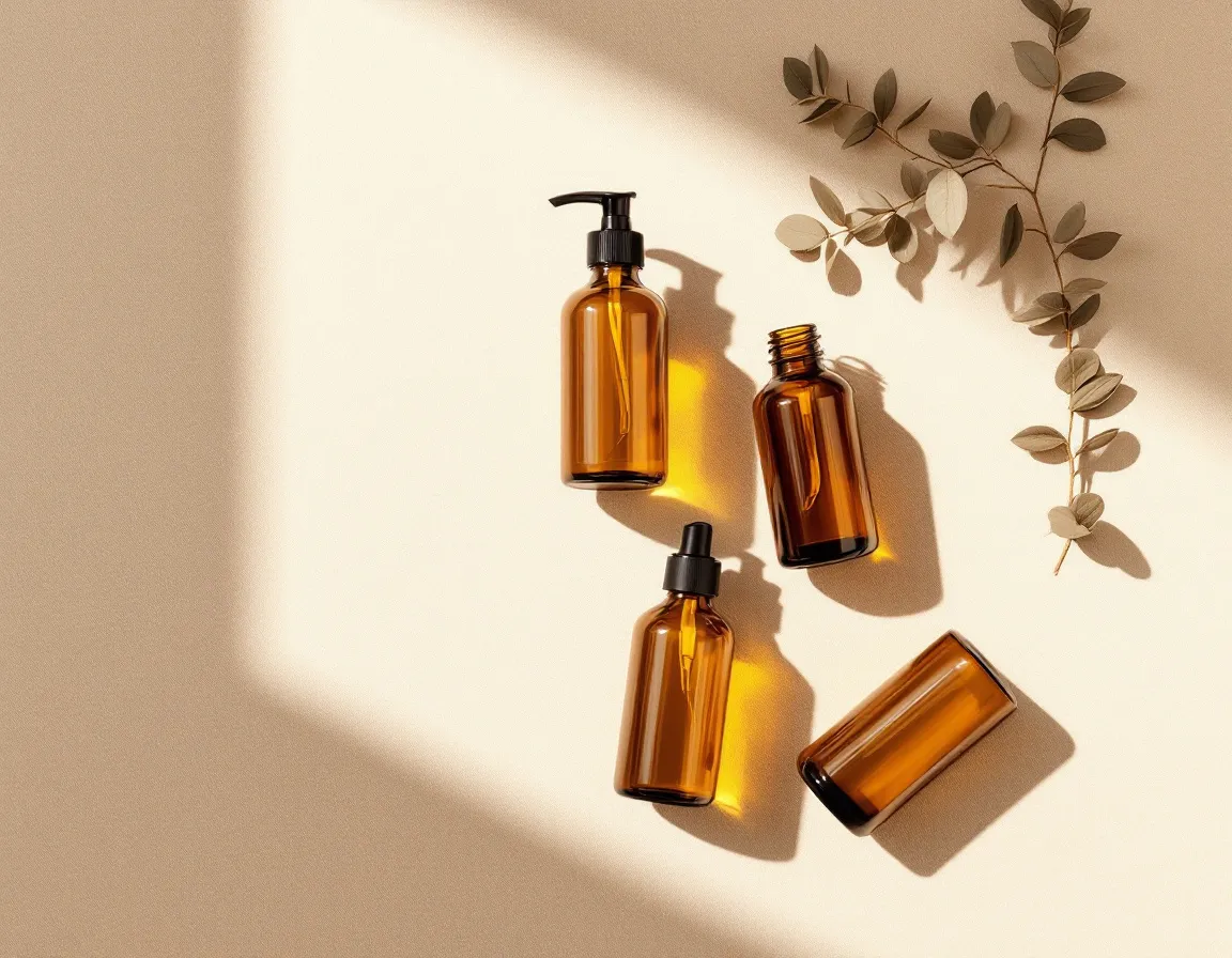
Overhead flat-lay photograph of four amber glass cosmetic bottles arranged in a square grid
on a sand-colored linen surface, generous even spacing, soft diffused daylight from above
creating soft shadows directly underneath each bottle, a single dried eucalyptus sprig in the
upper right corner for balance, no labels, no caps, sharp focus across the whole frame, 4:3
aspect, color graded warm and minimal.
为什么有效。 起作用的关键词是“来自上方的柔和漫射日光”(确定光线)、“方阵”(确定布局)、“全画幅锐利对焦”(防止模型自行添加浅景深)以及“无标签”(防止虚构品牌)。那枝尤加利是刻意的不对称——没有它,方阵中的四只瓶子会显得呆板。
提示词 8 —— 干净的等距产品渲染图(qwen-image-2.0,4:3)
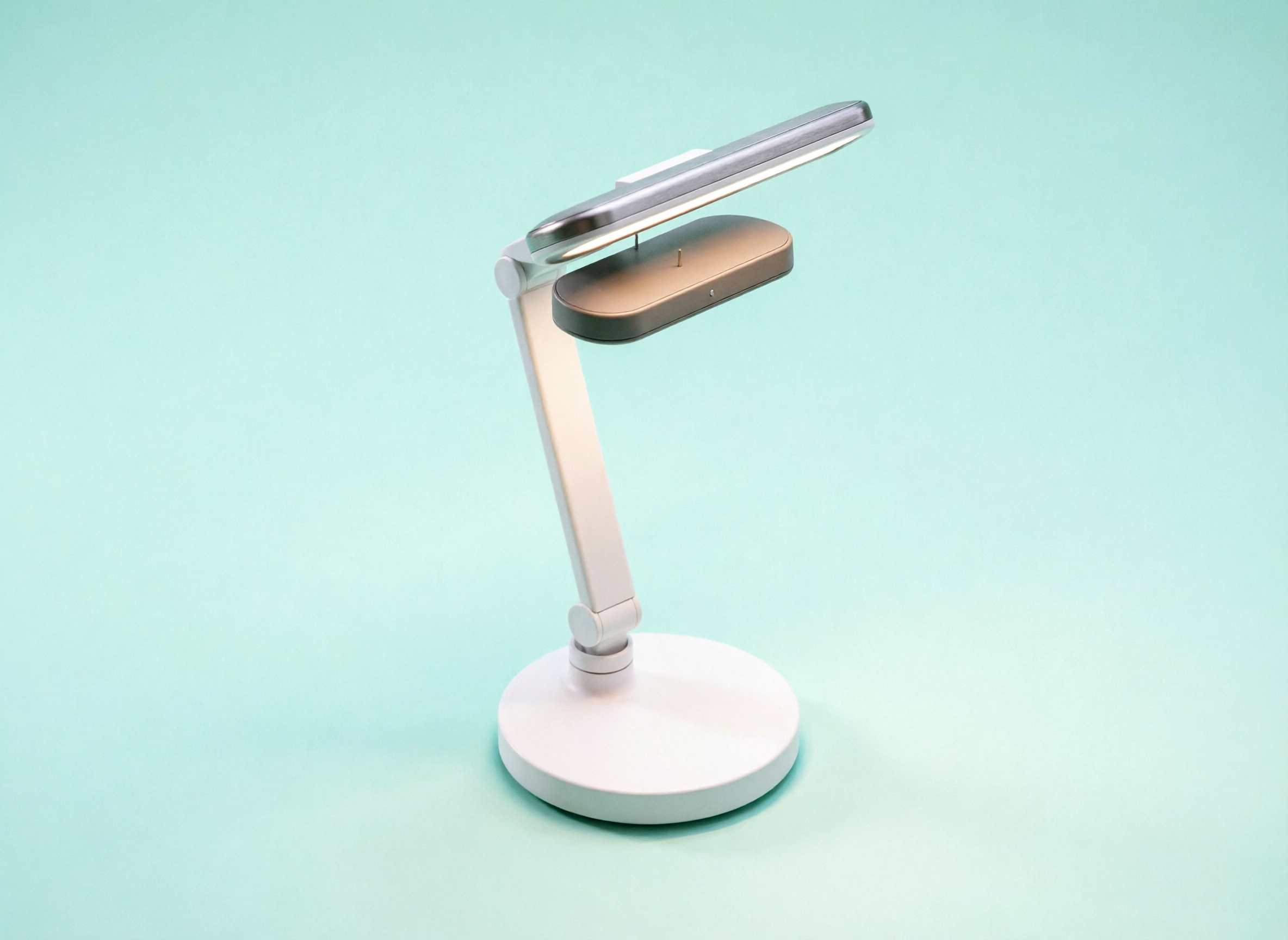
Clean isometric 3D illustration of a single smart desk lamp, exploded view showing four stacked
layers — base disc, articulated arm, head housing, LED panel — separated by thin connector
lines, on a pale mint background with a single very soft drop shadow, matte finish materials
in white and warm gray, no text, no annotations, 4:3 aspect, designed to sit cleanly on a
product specification page.
为什么有效(以及哪里无效)。 $0.025 的 qwen-image-2.0 是 hiapi 最具成本效益的模型,能可靠地拿捏哑光配色与干净构图。但它从纯文本提示词中通常拒绝渲染真正的爆炸视图——这里的结果是一盏干净的组装台灯,而非四个分离的层,即使部件已经逐一列出。制作爆炸示意图的诚实流程是:自己画一张粗略的分层草图,然后用 gpt-image-2/image-to-image 把它清理干净。把这一节当作它实际提供的教训:风格、光线和配色交给模型;当结构本身就是图像的重点时,结构要由你自己来画。
5. 风格化编辑插画
当文章本身就是产品时——长篇随笔、通讯、会议演讲——正确的开篇是插画而非照片。两种可靠风格:中世纪现代编辑插画(扁平形状、克制配色)与分层纸雕。两者看起来都明显是手工制作,能避开图库摄影的视觉疲劳。
提示词 9 —— 中世纪现代编辑插画(gpt-image-2,3:2)
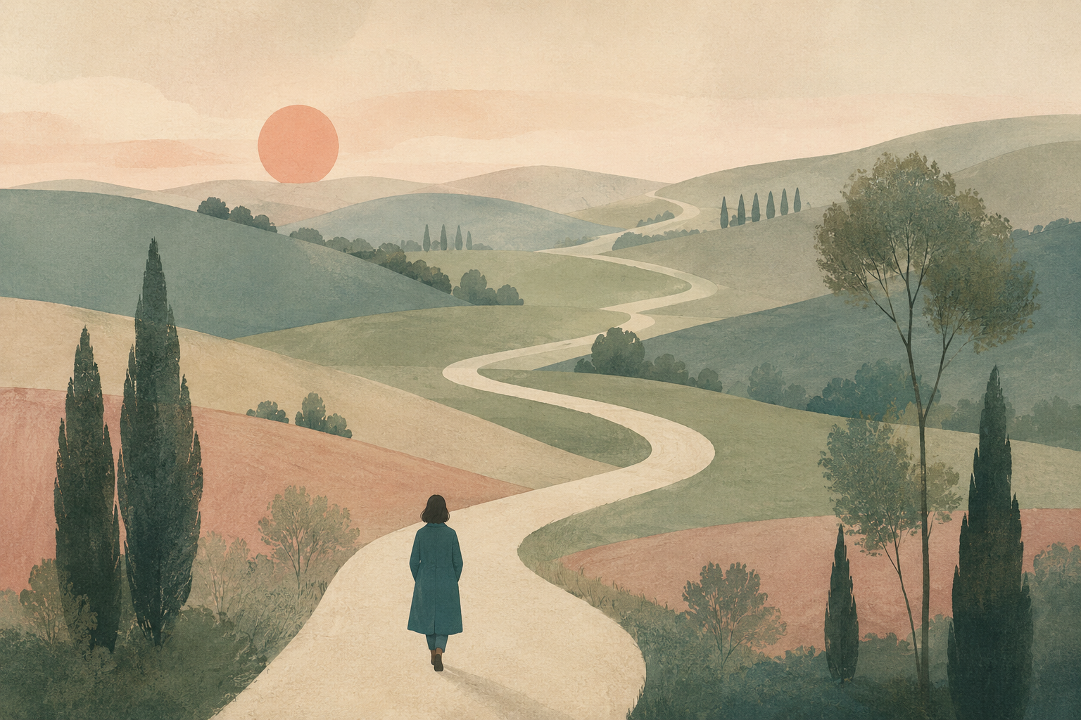
Editorial illustration for a long-form essay titled internally 'The slow web'. Composition: a
small figure in a teal coat seen from behind, walking on a winding cream-colored path that
loops through a soft pastel landscape of rolling muted hills, scattered slender trees, a low
watercolor sun. Style references mid-century editorial illustration, flat shapes, gentle paper
grain, restrained palette of teal, sage, cream and dusty rose, no outlines, no text, 3:2
landscape aspect.
为什么有效。 指明风格参照(“中世纪现代编辑插画”)比指明艺术家名字更可靠——它把模型引向一种可辨认的视觉传统,又不抄袭任何具体个人。“克制配色”并列出四种颜色,是比“柔和色彩”更强的约束;模型会精确混合那四种颜色,并跳过整个其余光谱。
提示词 10 —— 分层纸雕插画(qwen-image-2.0,1:1)
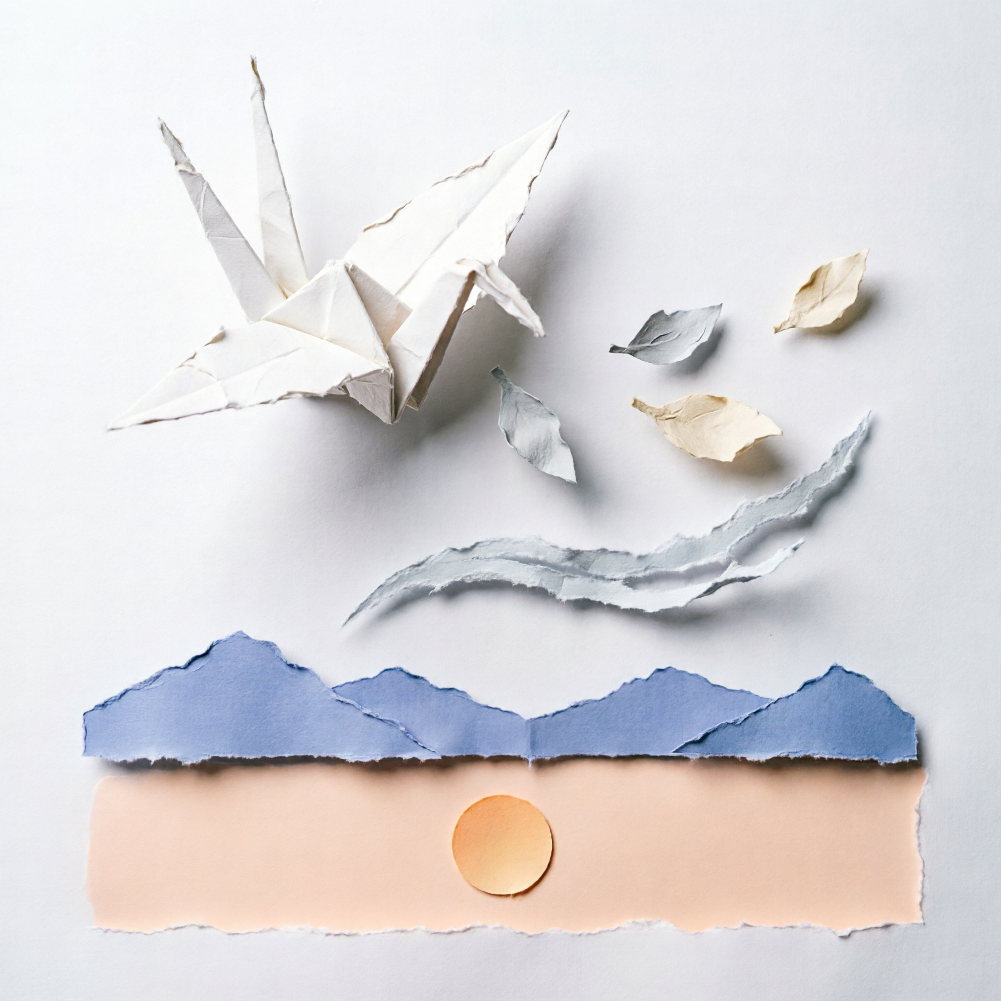
Layered paper-cut illustration of a single origami crane in flight, five distinct paper depth
planes from foreground to background — crane, drifting paper leaves, a torn arc representing
wind, distant mountains in pale indigo, and a flat sky with a single circular sun in pale
peach. Each layer has a soft cast shadow on the layer behind it, slightly rough cut edges,
matte paper texture, 1:1 aspect, balanced composition with the crane in the upper-left third.
为什么有效。 指定恰好五层能为纸雕效果带来深度,这正是它与扁平插画区分开来的地方。“边缘略有粗糙裁切感”和“哑光纸质感”是两句话,能防止模型把结果渲染成平滑的数字矢量——那会抹杀掉这种风格的全部意义。
如何改写这些提示词
三条规则贯穿上面所有章节。两次指定宽高比——一次在 API 调用里(hiapi 的 aspect_ratio 字段),一次在提示词文本里(“4:3 比例”)。模型会把两者都当作设计意图,结果便与页面容器的适配一致。明确写出要排除什么(“无标识”、“无文字”、“无渐变”),频率至少与写包含什么相当;负面清单和正面清单一样塑造结果。用传统或技术参照来锚定风格,而非艺术家名字——“中世纪现代编辑插画”、“35mm 胶片颗粒”、“等距 3D 插画”——从而获得可复现、版权干净的结果。
按任务选模型:高频风格化工作用 qwen-image-2.0,文字渲染吃重的用 gpt-image-2,人像一致性用 Nano-Banana,照片级真实用 flux-1.1-pro。上面每条提示词都在 hiapi 的 task API 上以 60-120 秒、每张 $0.025-$0.05 的成本运行过——足够便宜,所以正确的做法是每条生成三个变体,挑最强的一个,然后发布。