
Guide
gpt-image-2.5-sunburst Prompts: Copy-Paste Text-to-Image Recipes for Developers
How these prompt recipes are structured
Every recipe in this article follows the same five-field anatomy. Once you see the pattern, you can read any prompt here the way you read a function signature: each field is a named input with a known role, and the output changes predictably when you swap one out.
- subject — the literal thing being depicted. Keep this concrete and singular. "A matte ceramic bottle" beats "a product" because it removes an entire class of decisions from the model.
- style — the rendering language: flat vector, soft 3D render, editorial line art, photographic. Style terms compound, so two is usually enough and five starts to fight each other.
- composition — where the subject sits and how much room it gets. Centered with negative space, off-center, tiled, full-bleed. This field controls layout more reliably than any other.
- lighting — direction, softness, and contrast. "Soft directional light from upper left" is a usable instruction; "good lighting" is not.
- constraints — the guardrails. What must not appear, what must stay readable, what color range is allowed. Constraints are the field most people skip and the one that makes prompts reusable.
Written out as a template, it looks like this:
{subject}, {style}, {composition}, {lighting}, {constraints}
The value of this structure is not aesthetic. It is that each field becomes a variable you can fill programmatically, diff between versions, and regression-test across calls. A one-off prompt string is a magic number; a five-field template is a schema.
When you write your own recipes, keep the field order stable. Models weight earlier tokens more heavily in practice, and a consistent order means a change in output can be attributed to the variable you actually changed rather than to a reshuffled prompt.
Setting up a copy-paste recipe workflow
The workflow is deliberately boring: template, fill, call, store. Boring is what makes image generation reproducible enough to ship.
1. Store the template, not the string
Keep each recipe as a template with named placeholders. Do not paste a finished prompt directly into your calling code — you will lose the ability to vary it later without archaeology.
template = (
    "{subject}, {style}, {composition}, {lighting}, {constraints}"
)

def build_prompt(**kwargs):
    return template.format(**kwargs)
2. Fill variables from a dict
Treat the variable set as data. That way the same recipe can generate a family of images from a config file or a database row.
recipe = {
    "subject": "a single matte ceramic bottle with a minimalist label",
    "style": "clean product photography, soft 3D render",
    "composition": "centered, generous negative space on the right",
    "lighting": "soft directional light from upper left, gentle falloff",
    "constraints": "no text artifacts, no clutter, neutral background",
}

prompt = build_prompt(**recipe)
3. Call the endpoint
Send the assembled prompt to gpt-image-2.5-sunburst/text-to-image through the HiAPI.ai unified interface. Keep the request parameters (size, format, count) in the same config object as the variables so a single record describes a complete generation.
4. Log the full input, not just the output
Persist the filled prompt, the recipe version, and the parameter set alongside every returned image. When an output looks wrong three weeks later, the log tells you whether the prompt changed or the model did.
That four-step loop is the entire system. Everything else in this article is just recipes that plug into it.
Recipe 1: product-style hero image
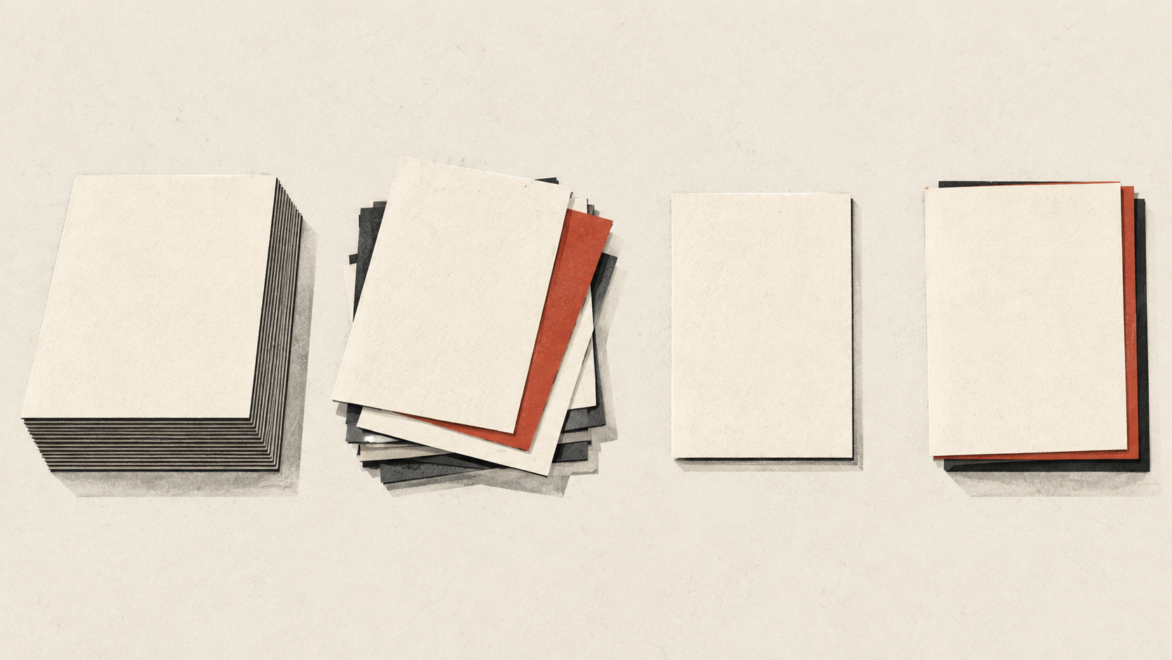
This is the workhorse recipe for landing pages, docs headers, and storefront tiles. It works because the composition field does the layout work and the constraints field guarantees space for a headline.
The prompt
{subject}, clean product photography with soft 3D render finish,
centered subject with generous negative space on the right,
soft directional light from upper left with gentle falloff,
neutral seamless background, no text artifacts, no clutter, no harsh shadows
A filled example:
a single matte ceramic bottle with a minimalist label, clean product
photography with soft 3D render finish, centered subject with generous
negative space on the right, soft directional light from upper left with
gentle falloff, neutral seamless background, no text artifacts, no
clutter, no harsh shadows
What the real output shows
In practice this recipe lands the subject near center with a clear right-hand zone of empty background — usable as-is for an overlaid headline without retouching. The lighting reads as a single soft source rather than a flat ambient wash, which gives the object a readable edge on the lit side and a soft transition into shadow on the other.
The constraint terms do measurable work here. Without "no text artifacts," labels tend to acquire invented lettering; with it, the label stays abstract. Without "no harsh shadows," the falloff tightens into something closer to studio hard light. Both changes are visible, and both are the kind of regression you want to catch before it reaches a page.
Varying it safely
Swap subject freely — bottles, headphones, boxes, devices all hold the composition. Leave composition and lighting alone unless you have a specific layout reason; those two fields are what make the output drop into a template without redesign.
Recipe 2: editorial illustration with a consistent palette
Editorial recipes are where palette variables earn their keep. The goal is an illustration that reads as part of a series — same visual family across a dozen articles — without regenerating from scratch each time.
The prompt
{subject}, flat editorial illustration with subtle line texture,
{composition}, limited palette of {palette},
soft even lighting with no dramatic shadows,
no gradients, no photorealism, no text elements
A filled example:
an abstract diagram of connected ideas, flat editorial illustration with
subtle line texture, centered composition with breathing room around the
edge, limited palette of deep teal, warm sand, and off-white, soft even
lighting with no dramatic shadows, no gradients, no photorealism, no
text elements
How the palette variable behaves
Naming two to three colors plus a neutral holds together reliably. The output respects the named hues as the dominant family and uses the neutral as ground, which is exactly what keeps a series coherent.
Two failure modes show up in real outputs. First, naming five or more colors produces something closer to a rainbow — the palette stops reading as limited, and the illustration loses its editorial restraint. Second, if you omit the neutral entirely ("deep teal and warm sand" with nothing else), backgrounds tend to fill with one of the two accent colors, which flattens the contrast you wanted.
Series discipline
Freeze style and constraints across the whole series and vary only subject and, occasionally, composition. When a new article needs its own illustration, you change one field and get a sibling rather than a stranger. That is the whole point of a recipe: visual consistency as a side effect of parameter discipline, not as an art direction task repeated every week.
Recipe 3: UI-adjacent background pattern
Background textures are the least glamorous recipe and the one that most often ships broken, because a texture that looks fine in isolation can destroy text legibility once it sits behind a paragraph.
The prompt
{subject}, subtle abstract texture pattern, {scale} scale repetition,
low contrast with soft tonal variation, muted palette of {palette},
even flat lighting, no focal point, no text, no high-frequency detail,
keeps center area clear and low-contrast for text overlay
A filled example:
organic flowing line shapes, subtle abstract texture pattern, medium
scale repetition, low contrast with soft tonal variation, muted palette
of pale slate and warm grey, even flat lighting, no focal point, no
text, no high-frequency detail, keeps center area clear and low-contrast
for text overlay
Why the constraint terms matter
"No focal point" is the load-bearing phrase. Without it, textures tend to organize themselves around a dominant shape in the middle of the frame — which is precisely where your headline goes. "No high-frequency detail" prevents the fine speckle that turns into visual noise behind small type, especially on lower-DPI displays.
The final clause, keeping the center clear and low-contrast, is a compositional constraint rather than a style one. It nudges the busier parts of the pattern toward the edges, which gives you a safe zone for text without needing an additional scrim layer.
Scale as a variable
scale is safe to change and changes the feel of the texture considerably. Small scales read as paper grain and suit dense UI panels; large scales read as editorial spread backgrounds and suit wide headers. Re-render at two scales and pick per surface rather than trying to make one image serve every context.
Swapping prompt variables without breaking output
Not all fields are equal. Based on real outputs across these recipes, here is the practical risk map.
Low-risk swaps
- subject — the highest-value variable and generally safe, as long as it stays in the same category. A bottle for headphones works; a bottle for a crowd scene does not, because the composition field was written for a single centered object.
- palette (within limits) — swap color names freely, but keep the count at two to three plus a neutral.
- scale — changes character without breaking structure.
Medium-risk swaps
- composition — safe to move between compatible layouts (centered, off-center, tiled), but each change alters how much negative space you get. If a downstream template depends on a specific empty zone, verify after changing.
- lighting — direction changes read clearly and usually work; flipping from soft to hard changes the entire mood and may conflict with a "clean" or "subtle" style term.
High-risk swaps
- style — swapping between flat vector and photographic is effectively a new recipe. The composition and constraint terms were written for one rendering language and often stop making sense in another.
- constraints — removing a constraint is the single most common cause of a prompt that used to work now producing unusable output. Treat constraint edits as code changes: make them deliberately, and re-check the result.
A practical rule
When you need a new image, change one field at a time and compare against the previous output. If you change two, you cannot tell which one caused a regression — the same debugging discipline you would apply to any other parameterized system applies here, and it is the difference between a prompt library that stays useful and one that quietly rots.
Evaluating and shipping generated images
Before an image goes into a product surface, run it against a short fixed checklist. The criteria should be identical every time, so that a "pass" means the same thing across calls, recipes, and teammates.
The four-point check
- Adherence to constraints. Does the output actually honor the negative clauses? No invented text, no focal point where there should be none, palette within the named range. This is the first gate because constraint failures are the hardest to fix downstream.
- Composition stability. Does the subject sit where the recipe promises, with the negative space your layout needs? If a template expects a clear right-hand zone, measure it, don't eyeball it.
- Legibility in context. For anything that sits behind or beside text, composite it with real copy at real sizes. Textures and illustrations that pass in isolation routinely fail here.
- Series consistency. If this image belongs to a set, place it next to two siblings. Same palette family, same line weight, same level of detail. A single outlier breaks the set more than a single weak image does.
Shipping discipline
Keep the recipe version, the filled prompt, and the parameter set attached to every image you keep. When an output later looks off, you can re-run the exact call and determine whether the input drifted or the model's behavior did — and you can regenerate the whole series from stored recipes rather than hunting through chat history.
Copy-paste readiness is the throughline: any teammate should be able to take a recipe from this article, fill the variables, and reproduce a result without re-tuning a single word. Build the library that way and image generation stops being a per-image negotiation and becomes a service your team calls.
Related articles
View all articles →-

Guide
Getting Started with seedream-5.0-pro/image-to-image: Capabilities, Pricing, and Integration Essentials
Capability boundaries, billing model, and engineering integration practices for ByteDance's image editing model
-

Guide
seedream-5.0-pro Text-to-Image Getting Started Guide: Capability Boundaries, API Integration, and Cost Control
A hands-on developer perspective: from key parameters to a cost estimate of $0.05 per image
-
Guide
Hailuo 2.3 Fast Image-to-Video Getting Started Guide: Capability Boundaries, Pricing, and Integration Practices
MiniMax image-to-video model selection and integration key points for developers