
Guide
GPT-Image-2 Text-to-Image Prompt Recipes: Copy-Paste Prompts for Developers
A developer's guide to copy-paste prompt recipes on gpt-image-2/text-to-image@ext
Why prompt recipes beat one-off prompts
Most developers treat image generation like a slot machine: type a sentence, pull the lever, look at the result, shrug, and try again. That works for a demo. It falls apart the moment you need the same kind of image across a dozen endpoints, a UI refresh, or three client projects running in parallel.
A prompt recipe is different. It is a small, versioned document that describes how to produce a certain class of image, not one specific image. Because it is structured, it is testable, diffable, and shareable.
A recipe typically contains four blocks:
- Subject — what is actually in the frame (object, character, scene, abstraction).
- Style — the visual language: photographic, flat vector, isometric, watercolor, 3D render, and so on.
- Composition — framing, camera angle, negative space, where the subject sits.
- Output constraints — aspect ratio, intended use, and any quality or resolution intent.
The payoff is consistency. When two images come from the same recipe with only the subject swapped, they look like siblings. When they come from one-off prompts, they look like strangers. In a product surface — onboarding illustrations, marketing banners, empty states — sibling resemblance is the whole point.
Recipes also make failures debuggable. If an output is wrong, you can ask which block broke instead of rewriting everything. And because each block is plain text, you can store recipes next to your code and review prompt changes the same way you review a diff.
On gpt-image-2/text-to-image@ext, this discipline costs almost nothing: a recipe is just a well-ordered prompt plus a couple of request parameters. The sections below give you the anatomy, the aspect-ratio handling, the resolution notes, and a set of recipes you can copy directly.
The anatomy of a copy-paste recipe
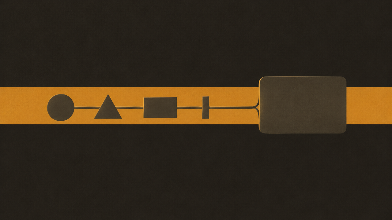
A recipe that survives real use has a fixed skeleton with variable slots. Here is the skeleton, written so you can paste it into a code comment and fill it in:
SUBJECT: <the single thing this image is about>
DETAIL: <2-4 concrete attributes: material, color, texture, era>
STYLE: <named visual style + one reference adjective>
COMPOSITION: <framing, angle, subject placement, negative space>
LIGHT & COLOR: <lighting direction, palette, contrast>
CONSTRAINTS: <must have / must not have>
INTENT: <where this image will be used>
The order matters more than it looks. Put the subject first so the model anchors on it. Put constraints last so they read as final instructions rather than early noise. Keep every line concrete — "matte ceramic" beats "nice material", and "three-quarter view from slightly above" beats "good angle".
Here is a filled-in example, ready to copy:
SUBJECT: a single ceramic coffee mug
DETAIL: matte off-white glaze, visible throwing rings, thin unglazed rim, small handle on the right
STYLE: product photography, soft and minimal
COMPOSITION: centered, three-quarter view from slightly above, generous empty space around the subject, no props
LIGHT & COLOR: large soft light from upper left, gentle falloff shadow to lower right, neutral warm-white background
CONSTRAINTS: no text, no logos, no hands, no reflections of people
INTENT: e-commerce product tile, will be cropped to a square
A few habits make this skeleton hold up:
- One subject per recipe. If you find yourself writing "and", split it.
- Name the style. "Minimal" is vague; "flat vector illustration with 2px strokes" is a recipe.
- Say what to exclude. Models fill silence. If the image must stay text-free for a localization pipeline, state it.
- Write INTENT as if a human designer will read it, because you will, six months from now.
Once this skeleton feels natural, every recipe in this article is just a different fill-in.
Working with the 16 aspect ratios
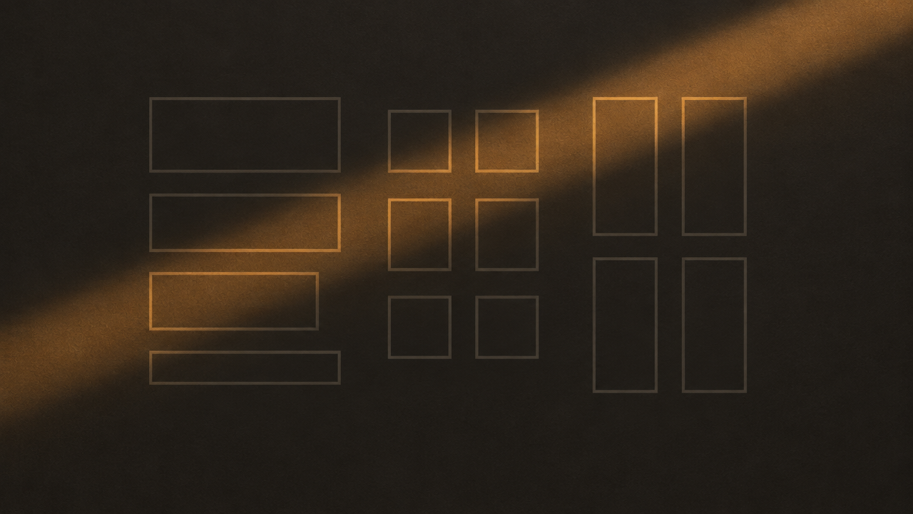
gpt-image-2/text-to-image@ext exposes 16 output aspect ratios. That is generous, and generosity is exactly why people waste reruns: they pick a ratio by vibe, get a composition that does not fit, and regenerate.
Avoid that by choosing in the opposite order — start from the destination surface, then pick the ratio, then write the composition line to match.
Group ratios by where the image lands
- Wide banners and heroes — landscape ratios, roughly 16:9 through 21:9 territory. Composition line: wide horizontal framing, subject offset to one side, large empty region on the opposite side for text overlay.
- Square tiles, avatars, app icons — 1:1. Composition line: centered subject, tight symmetric framing, subject fills most of the frame, minimal margin.
- Vertical feed and story posts — tall ratios, roughly 4:5 through 9:16. Composition line: vertical framing, subject in the upper two-thirds, soft empty band at the bottom.
- Documents, thumbnails, print-ish layouts — classic 4:3 and 3:2 style ratios. Composition line: balanced framing, subject centered with even margins on all sides.
Put the ratio in the prompt, not just the request
The request parameter decides the canvas. The prompt decides what fills it. If you only set the parameter, you often get a wide canvas with a subject composed for a square — a tiny object floating in space. So always pair the two:
COMPOSITION: wide horizontal framing, subject on the left third,
clean negative space on the right for a headline,
no elements crossing the center line
Two rules that kill most reruns
- Never ask for text placement you have not reserved space for. Negative space is a prompt instruction, not an afterthought.
- Pick the ratio before you iterate on style. Style changes are cheap to re-evaluate; re-composing for a new frame is not.
If you are unsure between two ratios, generate the square version first. Squarish compositions crop into both wide and tall frames with the least damage, which makes it the safest starting point for a recipe you have not tested yet.
Adjusting recipes for 4K output
Higher-resolution requests change two things: what you should ask for in the prompt, and what you should verify in the response. The canvas gets bigger, but prompt intent does not automatically scale with it.
What to change in the prompt
Bigger output means the model has room to invent detail. That is usually good — fabric texture, edge definition, fine gradients — but it also means vague lines become visible flaws.
- Add a detail floor. Say what level of detail is appropriate: fine surface detail visible on the subject, clean simple background with no busy texture. Without this, high-resolution outputs often fill empty regions with noise.
- Tighten the constraint block. At small sizes, stray text is a smudge. At large sizes it is legible nonsense. Restate exclusions explicitly: no text, no watermarks, no signage.
- Be explicit about edges. If the asset will be masked or composited, ask for clean separation between subject and background, no fringing.
- Do not cram more subjects in. More pixels is not a license for more content; it is a license for more fidelity on the same content.
What to check in the response
- Actual returned dimensions — confirm the response matches what you asked for rather than assuming it.
- Downscale behavior — if your pipeline resizes for web delivery, check the resize after generation, not before. Generating large and scaling down preserves detail better than the reverse.
- File size and format — large outputs cost bandwidth. Decide early whether the large variant is an archival asset or a delivery asset.
- Composition under crop — verify the negative space you reserved still exists at the larger size; recomposition happens less often but it is worth a glance.
A practical default
Keep two variants of each recipe: a draft variant for iteration and a final variant with the tighter detail and constraint lines above. Iterate cheaply on the draft, then run the final once. Your development loop stays fast and your production assets stay clean.
Recipe patterns for common developer use cases
These are starting points, not finished art. Copy one, fill in the bracketed slots, and adapt the composition line to your target surface.
Icon and glyph recipes
SUBJECT: a [concept] icon
DETAIL: single flat shape, rounded corners, 2px uniform stroke weight, solid fill
STYLE: flat vector, geometric, minimal
COMPOSITION: centered, subject fills ~80% of frame, perfectly symmetric, square framing
LIGHT & COLOR: single accent hue on transparent-friendly neutral background, no gradients
CONSTRAINTS: no text, no shadows, no 3D perspective, no fine detail that breaks below 32px
INTENT: UI icon set, 1:1
The line that matters here is the last constraint. Icons die at small sizes, so explicitly forbid detail that cannot survive scaling.
Product mockup recipes
SUBJECT: [product] shown in a realistic setting
DETAIL: [material], [finish], [key feature visible]
STYLE: clean commercial photography
COMPOSITION: three-quarter view, subject on the right, soft empty surface on the left for a caption, moderate depth of field
LIGHT & COLOR: soft key light from the left, restrained palette, neutral backdrop
CONSTRAINTS: no text, no brand marks, no hands, no clutter
INTENT: landing page hero, 16:9
Swap the subject line for each product and the family stays visually coherent — which is exactly what a catalog needs.
Background and texture recipes
SUBJECT: an abstract background for [context]
DETAIL: soft geometric forms, subtle grain, low contrast
STYLE: modern, restrained, editorial
COMPOSITION: full-bleed, no focal point, even visual weight across the frame, generous safe margins at all edges
LIGHT & COLOR: diffuse light, [palette family] tones, no harsh highlights
CONSTRAINTS: no text, no recognizable objects, no faces, nothing that competes with foreground content
INTENT: section background behind UI text, wide ratio
Backgrounds are the most reused asset in any product, and the most frequently broken by accidental focal points. The "no focal point" line is doing most of the work.
Branching one base into three
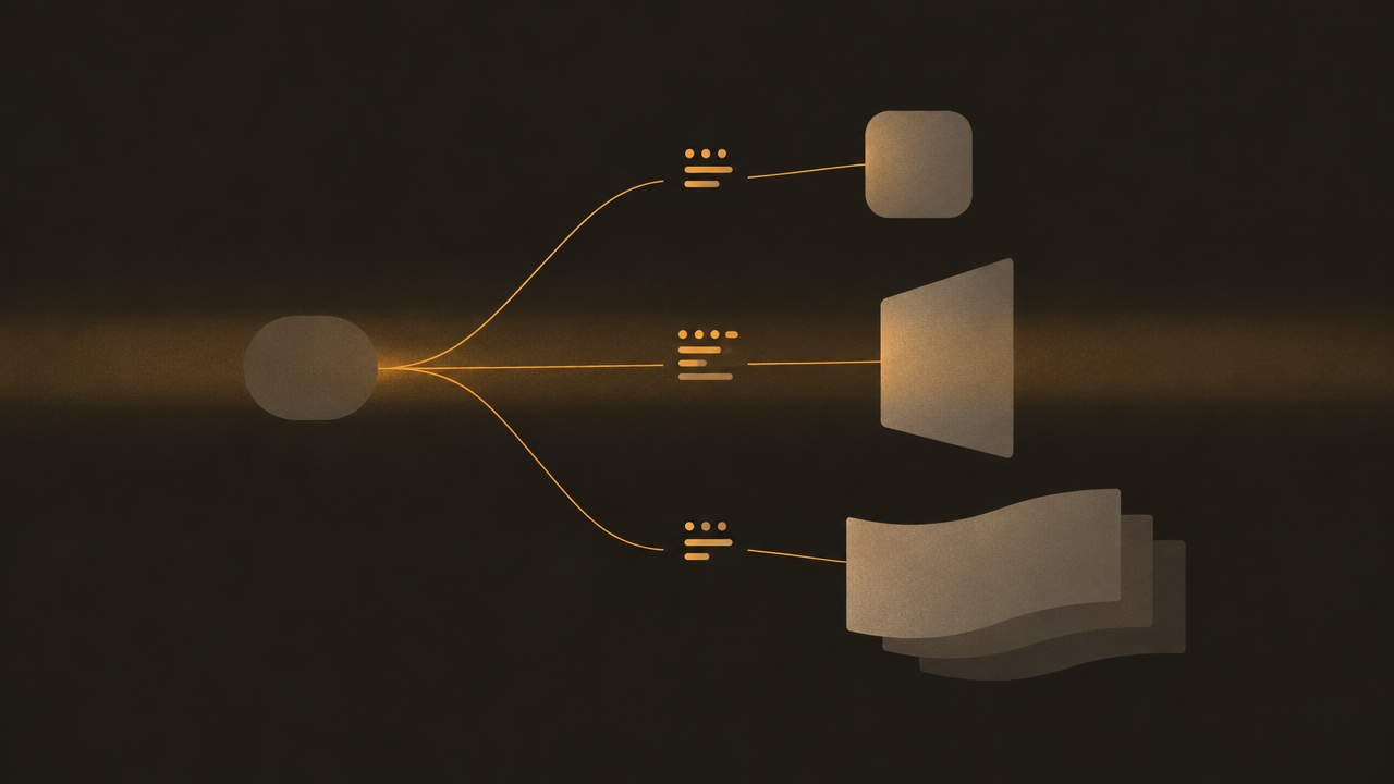
Notice these three share a skeleton. Start from your most-used recipe, keep STYLE and CONSTRAINTS stable, and vary SUBJECT, COMPOSITION, and INTENT. That is how a single tested prompt becomes a family without a redesign.
Testing, comparing, and reusing recipes
A recipe is only reusable if you can tell whether it is good. Here is a lightweight loop that costs little and catches drift early.
1. Freeze a test set
Pick three to five subject values that matter to your project and keep them constant. Every time you change the recipe, regenerate those same subjects. Comparing across changing subjects tells you nothing; comparing across a fixed set tells you everything.
2. Change one block at a time
If an output disappoints, do not rewrite four lines. Change COMPOSITION, regenerate, evaluate. Then change CONSTRAINTS. One variable per run keeps the cause traceable — the same reason you would not change three dependencies before a test run.
3. Score against intent, not taste
Write two or three binary checks derived from the INTENT line before you look at outputs. Examples: is the reserved empty region actually empty? Is the subject fully in frame? Is there any text? Binary checks beat vibes, and they are the only thing that scales when a teammate runs the recipe later.
4. Promote the winner into a template
When a recipe passes its checks consistently, promote it:
- Move it out of the scratch prompt and into a named constant or config file.
- Keep the bracketed slots as explicit parameters.
- Record the aspect ratio with the recipe so callers do not have to guess.
- Add a one-line note describing what the recipe is for.
That promotion step is the difference between a prompt you used once and a template the whole project shares.
5. Re-test after model or parameter changes
Any change to output parameters — ratio, resolution intent — is a recipe change. Rerun the frozen test set. Most regressions show up as a broken composition line, not a broken style, so check the framing first.
Keep the loop boring and small. A five-minute comparison beats a week of reshoots.
Common failure modes and quick fixes
Most bad outputs map to a specific line in the recipe. Learn the symptom-to-fix mapping in your head and debugging gets fast.
The subject is tiny and floats in space
Cause: the canvas is wide or tall, but the composition line was written for a square.
Fix: rewrite COMPOSITION to name the framing explicitly — subject fills most of the vertical frame, or subject anchored to the left third. Never rely on the ratio parameter alone.
Unwanted text appears
Cause: an unstated constraint, or a composition that invites signage (a shopfront, a screen, a label).
Fix: add no text, no lettering, no signage, no watermarks to CONSTRAINTS, and remove the object that tempts it.
Style drifts between runs
Cause: a vague STYLE line. "Modern" is not a style.
Fix: name the medium and add one concrete adjective: flat vector illustration, 2px strokes, limited palette. Consistent style language produces consistent style.
Background is busy and ruins the layout
Cause: no negative-space instruction, or a detail line that lets the model fill empty regions with texture.
Fix: reserve space explicitly in COMPOSITION and cap texture in DETAIL: clean simple background, no busy texture.
Edges are fuzzy when compositing
Cause: the prompt never asked for separation. Fix: add clean separation between subject and background, no fringing, no glow. This matters most at larger output sizes.
Two subjects merged into one
Cause: the subject line contained "and". Fix: one subject per recipe. If you truly need a scene, describe it as a scene with a clear primary subject, not as a list.
The image is fine but wrong for the slot
Cause: INTENT was missing or ignored.
Fix: keep INTENT in the recipe and put the destination surface in the prompt text, e.g. designed for a wide hero banner with headline space on the right.
When a fix works, fold it back into the recipe — not the one-off prompt you just typed. That is how a recipe gets more reliable over time instead of being rediscovered every sprint.
Related articles
View all articles →-

Guide
Getting Started with seedream-5.0-pro/image-to-image: Capabilities, Pricing, and Integration Essentials
Capability boundaries, billing model, and engineering integration practices for ByteDance's image editing model
-

Guide
seedream-5.0-pro Text-to-Image Getting Started Guide: Capability Boundaries, API Integration, and Cost Control
A hands-on developer perspective: from key parameters to a cost estimate of $0.05 per image
-
Guide
Hailuo 2.3 Fast Image-to-Video Getting Started Guide: Capability Boundaries, Pricing, and Integration Practices
MiniMax image-to-video model selection and integration key points for developers